Pharmaceutical Branding and Website Design
MedPac is a new pharmaceutical company based in Edmonton, focused on developing high-quality pain and fever relief products for children, with additional formulations already in development. In an industry where trust, clarity, and compliance are non-negotiable, MedPac needed a brand presence that could reflect the seriousness of its mission while remaining accessible to Canadian families. That’s where Unicorn Pony stepped in.
We began by refining their existing logo into a modern, trustworthy brand mark that would stand confidently beside national competitors. From there, we developed a complete visual identity and created regulation-appropriate product and packaging mockups… clean, professional, and aligned with the visual language of leading pharmaceutical brands. Every element was crafted with both pharmaceutical standards and consumer accessibility in mind.
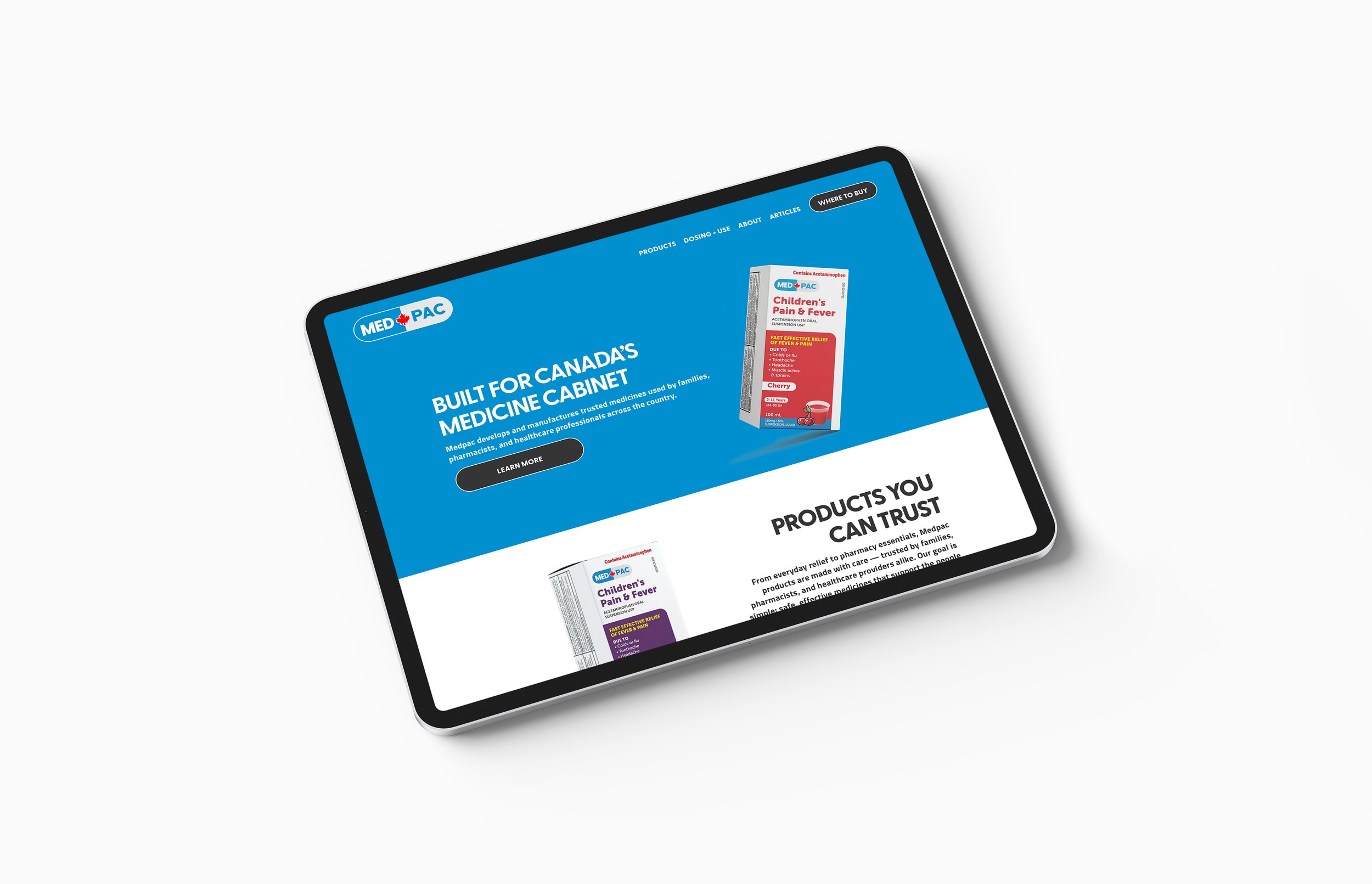
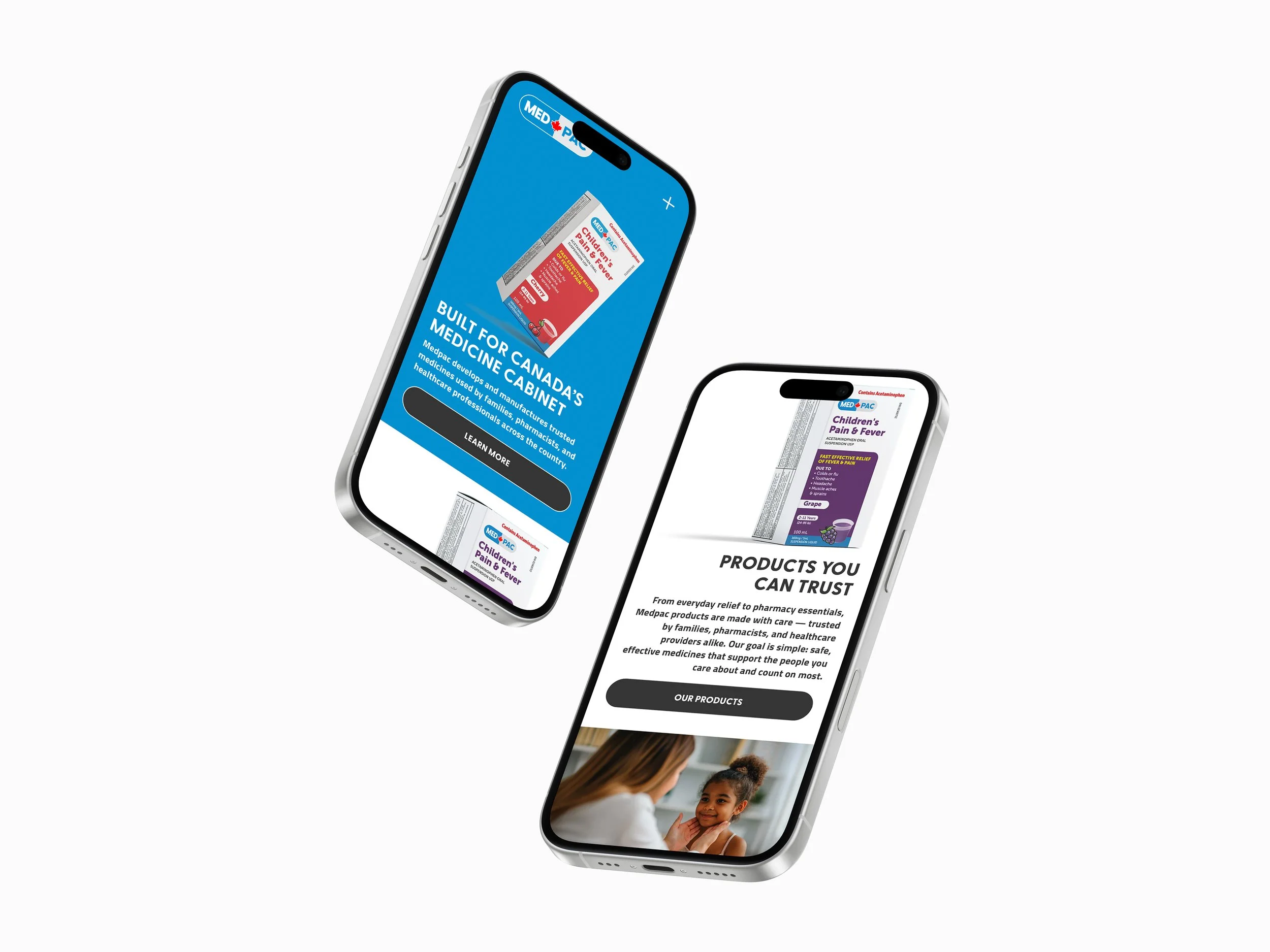
To complete the project, we built a fully customized website that balances information clarity with design credibility. The new site positions MedPac to stand out in the pharmaceutical space, combining a sleek, modern aesthetic with user-friendly functionality. It features a tailored dosing guideline, detailed product pages, and the framework to support future retail expansion, all supported by a strong SEO foundation. MedPac entrusted us to deliver not just a brand, but a scalable platform for long-term success, and we’re proud to have delivered. medpac.ca